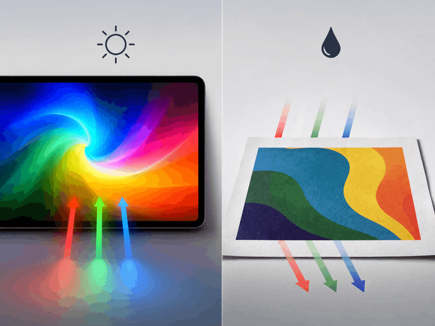
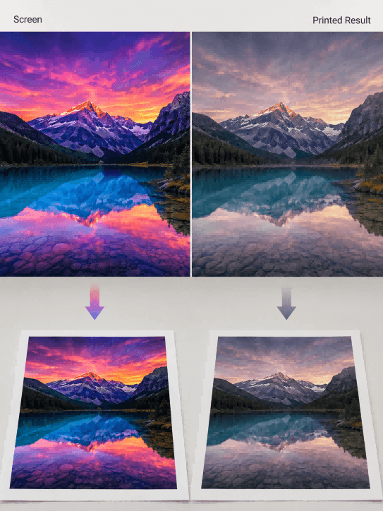
1. Screen Light Emission vs. Ink Light Absorption
When we draw on a computer or phone, the screen emits its own light, combining to create millions of extremely bright and vibrant colors (like neon green or bright blue). But in the factory, machines print with ink. Ink doesn’t emit light; it only absorbs and reflects it. Real-world inks simply cannot mix to produce those super bright, light-emitting colors seen on screens.
2. Colors Are “Forcibly Compressed”
Because the printer cannot recognize all the colors on a screen, when it encounters bright colors it cannot print, the machine automatically “compresses” them into the closest darker colors it can print. This is why you often feel that printed products look grayish and lifeless.
II. A “Pitfall Avoidance Guide” for Artists and Typesetters Submitting Artwork
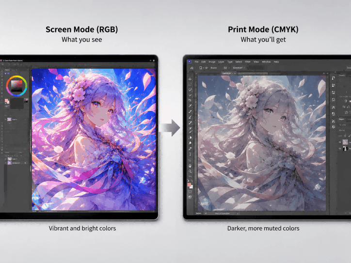
1. Switch Software to See True Colors
Many drawing programs (like SAI) only handle screen-emitted colors; printing directly from them is a guaranteed disaster. It’s best to put your finished drawing into professional layout software (like Photoshop) and force it into “print mode” (CMYK). This way, you can preview the true effect of the darkened colors on your computer and know what to expect.
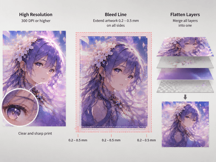
2. Keep Images Large and Leave Margin Space
-
Must be High-Definition: The image must be large and clear enough (at least 300 DPI/resolution), otherwise, pixelation will be very obvious when printed on transparent materials.
-
Prevent White Edges (Bleed Line): Machine hands can “shake” (margin of error) a bit when cutting edges. To prevent misalignments from exposing white edges, you need to extend the artwork outwards by 0.2 to 0.5 millimeters on all sides.
-
Merge Layers: Before submitting, flatten all the messy effects, texts, and layers into one clean image layer to prevent machine recognition errors.
III. Don’t Let Your Screen Deceive Your Eyes
1. Screens Need Calibration
Everyone’s monitor has different brightness and warm/cool color tones. The professional approach is to use a dedicated instrument to measure and calibrate the screen’s colors; otherwise, the colors you are looking at are inherently skewed to begin with.
2. The Ultimate Move: Proofing (Sampling)
No matter how you adjust it on the computer, before spending money on mass production, you must have the factory print a physical sample and ship it to you first. Seeing is believing—this is the most reliable way.
IV. Exclusive Secrets of Material for Custom acrylic standees: Flipping and White Ink
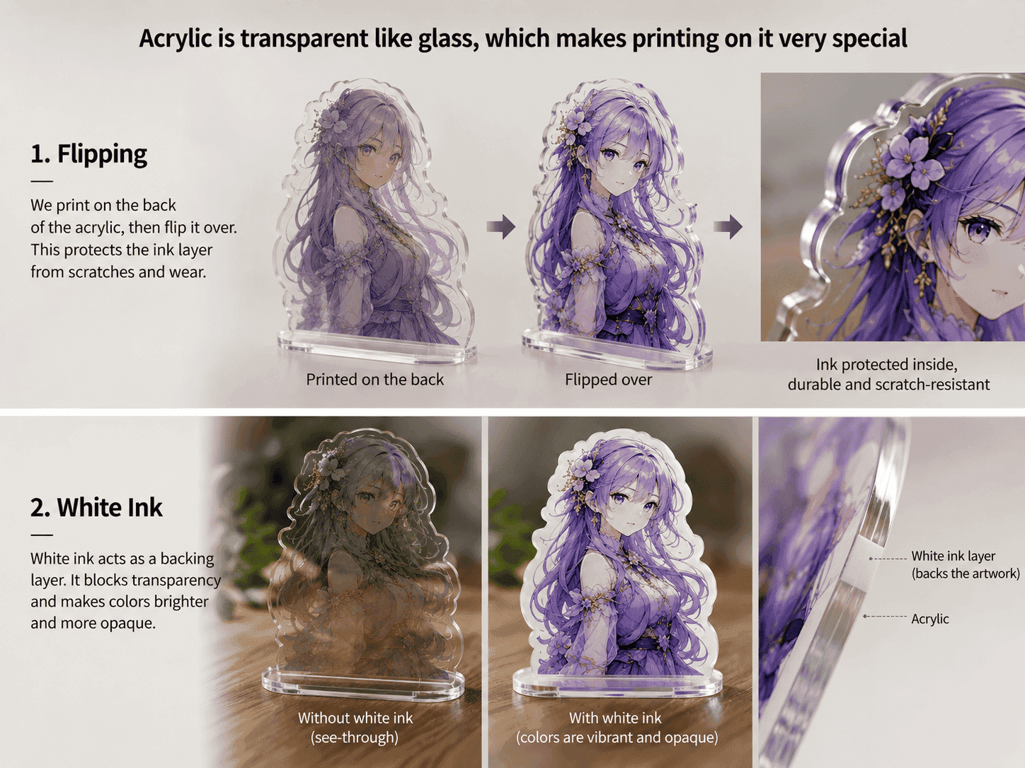
Acrylic is transparent like glass, which makes printing on it very special:
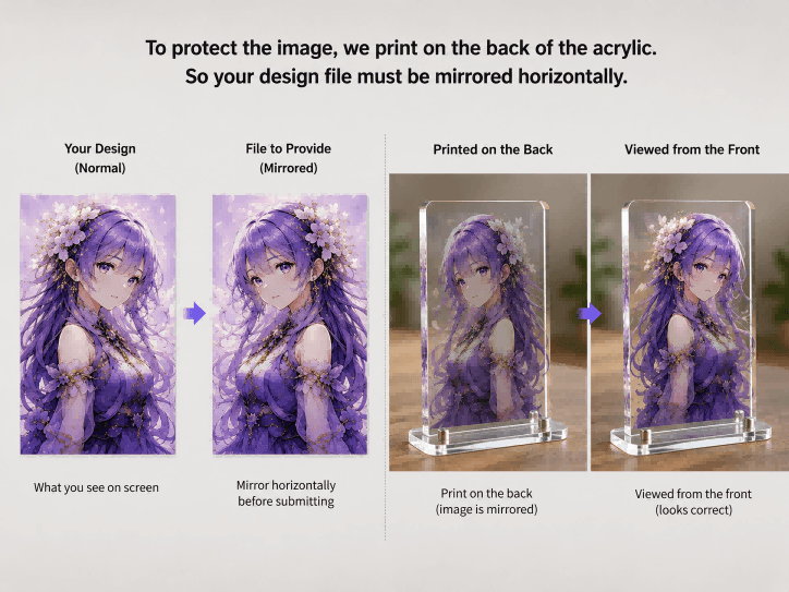
1. The Design Must “Look in the Mirror” (Mirror Image)
To protect the image from getting scratched, the design is usually printed on the back of the acrylic board. We view it from the front, looking through the transparent board. Therefore, the image you give to the factory must be mirrored horizontally so that it looks correct when viewed from the front after printing.
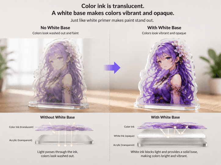
2. Why Must You Lay a “White Base”?
Color ink is actually translucent. If you print it directly onto transparent acrylic, light will shine right through it, making the colors look washed out and faint. To make the colors vibrant, a thick layer of opaque white ink must be laid down behind the color ink. It’s just like applying a layer of white primer before painting a wall; with a pure white base, the colors on top will shine.
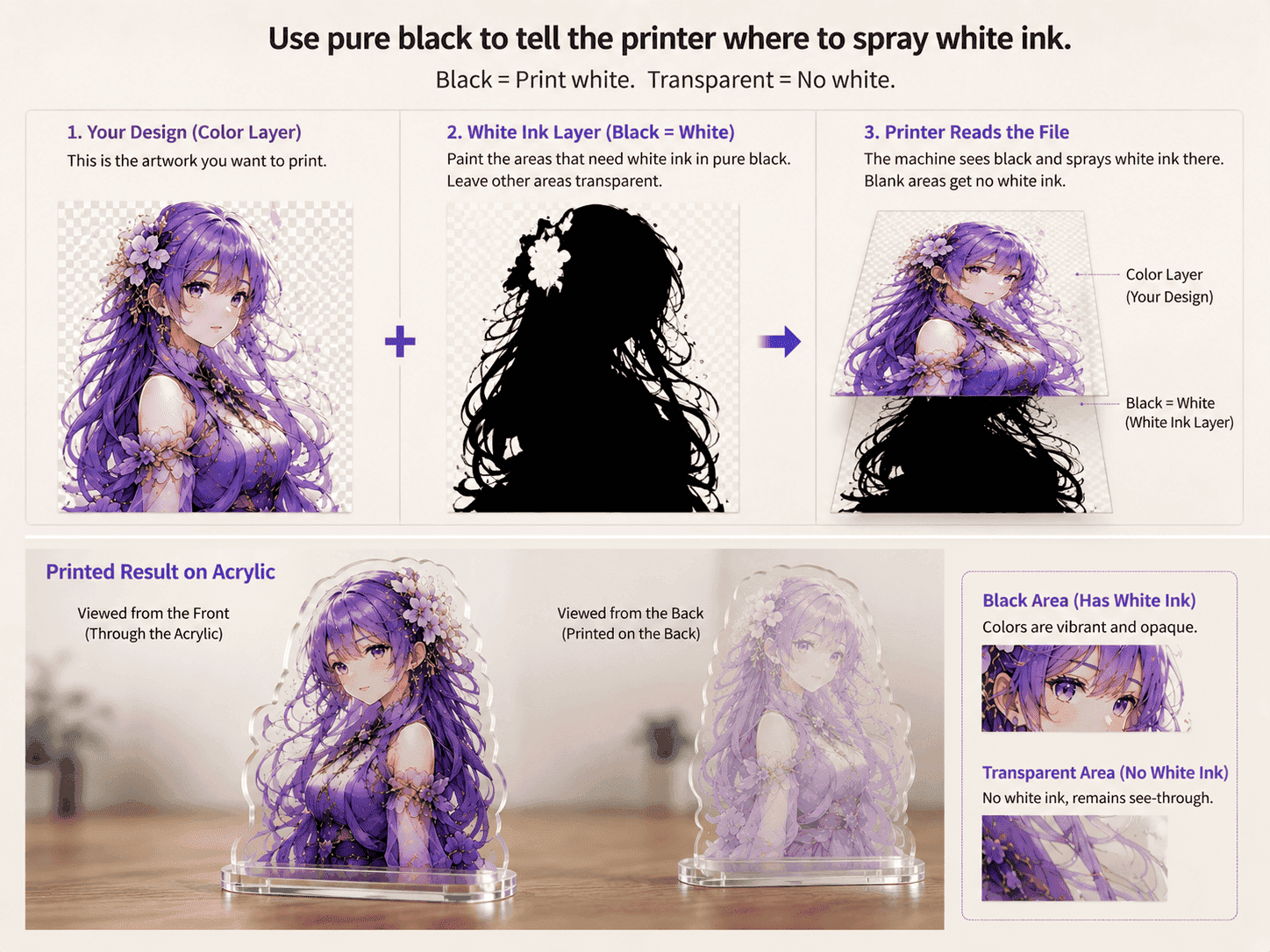
3. Counter-intuitive Operation: Using Pure Black to Represent Pure White
How do you tell the printer where to spray white ink? When designing, you need to create a separate layer. On this layer, paint everything where you want the white base to be in pure black. The moment the machine sees pure black, it understands: “Oh, I need to spray white ink here.” Leave the areas where you don’t want white ink completely blank and transparent.
V. Factory Quality Control and the Final Lighting Environment
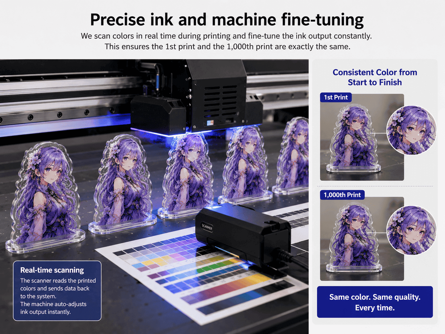
1. Fine-tuning of Ink and Machines
Every newly purchased batch of ink will have slight color variations. Reliable factories, especially those providing a professional acrylic standee printing service, use advanced scanners to scan the freshly printed colors while printing, constantly fine-tuning the ink output to ensure the first print and the thousandth print are exactly the same color.
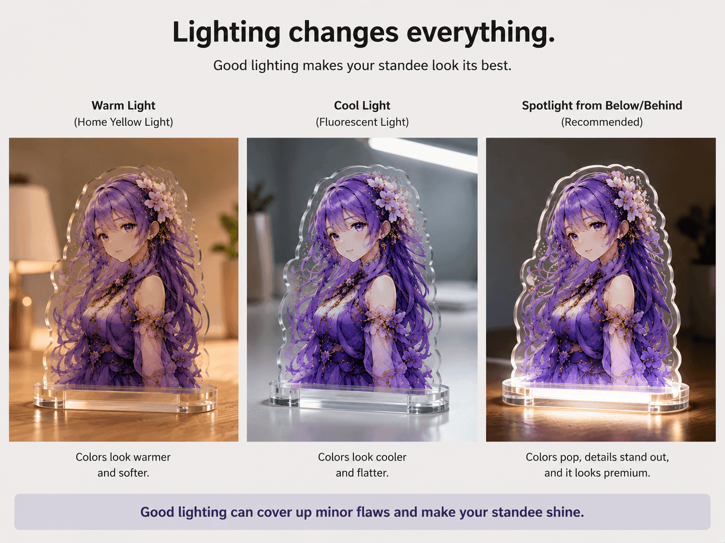
2. Lighting is Also a Magician
You’ve finally made the perfect standee, but the colors will look different in a home with warm yellow lights versus under cool white fluorescent lights. If you want to display your standees, it’s best to add a small spotlight at the bottom or back. Good lighting can cover up many minor flaws and make the standee instantly look premium.